Sometimes it’s interesting to look back at old things and see how far we’ve come – so when we stumbled across some screenshots of TurboLaw from way back when in 2003, we thought it’d be fun to do a little post to show just how far TurboLaw has come.
2003 – Navigator

TurboLaw looked very different back then – although in 2003 this sort of look was considered by some to be state of the art. How the times have changed!
2016 – Navigator
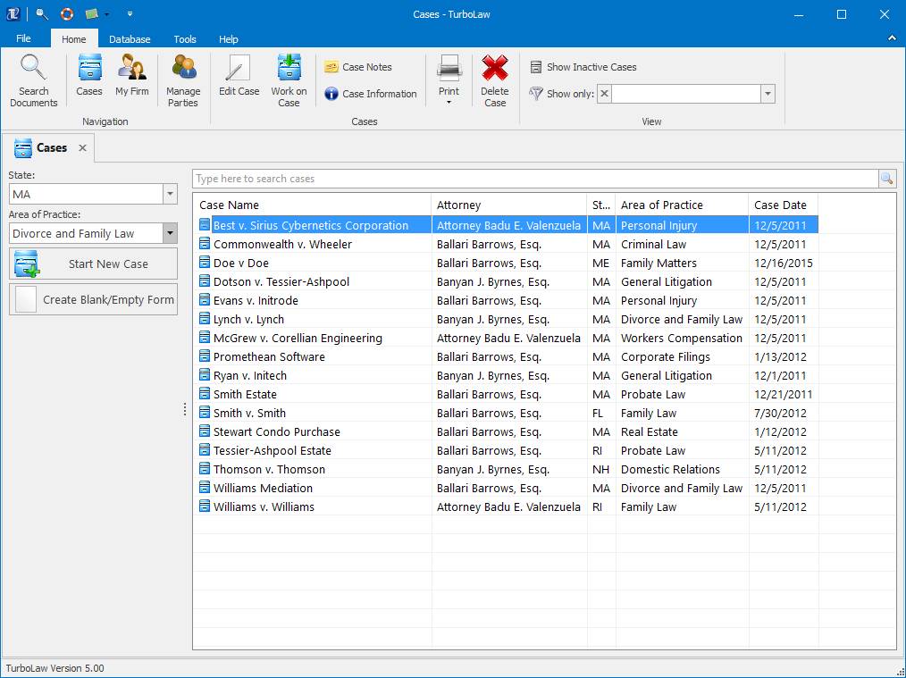
Now TurboLaw doesn’t just look good, but its appearance is based on research and feedback into how people use the program and has been carefully designed for ease-of-use.
Instead of a mish-mash of menus and buttons all over the place, everything is laid out neat and tidy at the top of the screen, with large & colorful buttons that clearly communicate their purpose, organized by what most people need to do most frequently.
2003 – Create Document
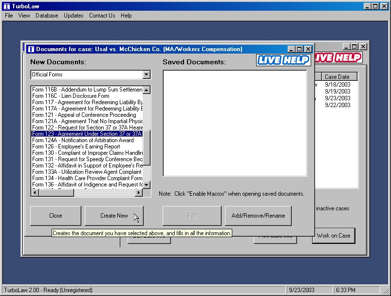
The old “create documents” window, although functional, was clunky to use – you couldn’t change the size of the list so you could read the entire name of a document, for example.
2016 – Create Document
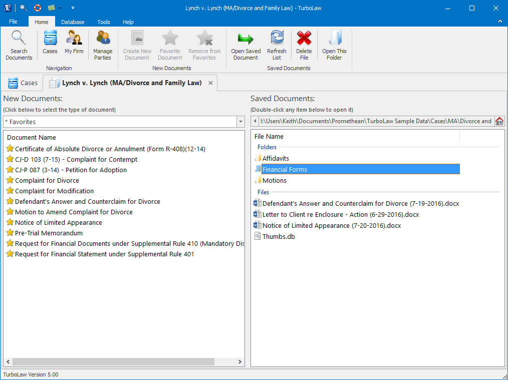
Now, not only can you change the size of the lists of documents, but you can sort the list (alphabetically or in reverse alphabetical order), scroll the list both horizontally and vertically, and you can mark documents as “favorites” so you don’t have to hunt for them each time.
On top of that, you can also have additional folders in your case file – no longer are you restricted to saving everything in one single place – and you can just drag & drop files in and out of TurboLaw.
2003 – Search
Searching for documents is something almost everyone does at some point, but this option was not always easy to find.
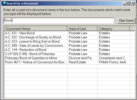
2016 – Search
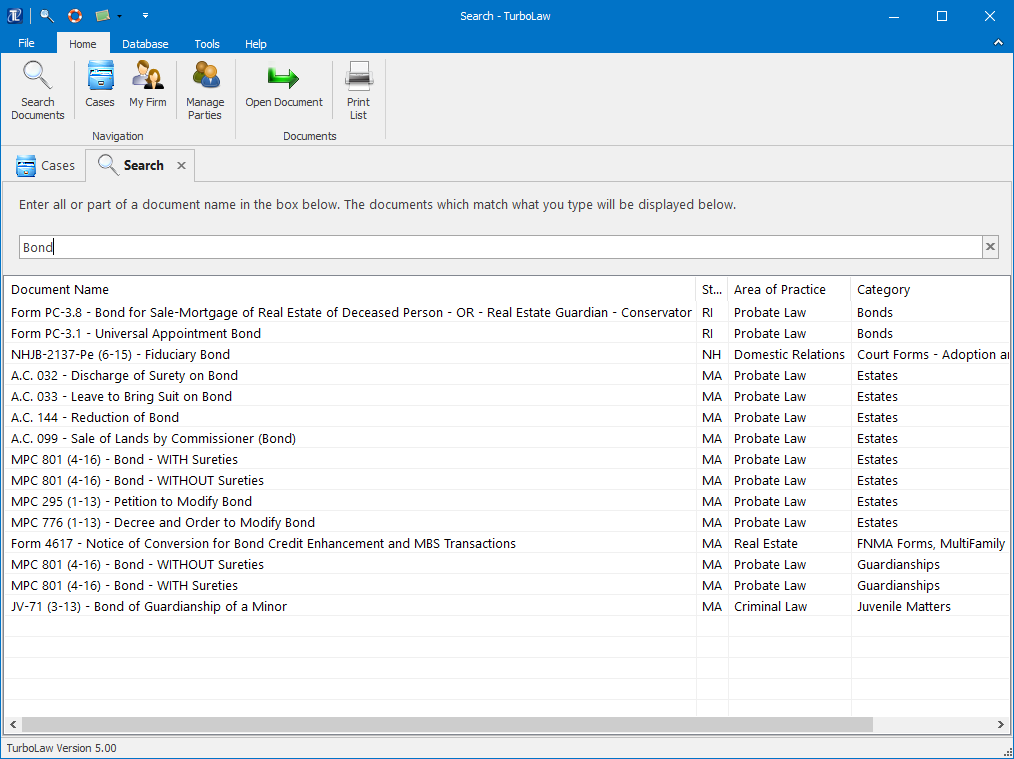
Now, though, “Search Documents” is the #1 button on TurboLaw’s toolbar/ribbon – always available to let you find a document quickly and easily.
2003 – Case Wizard
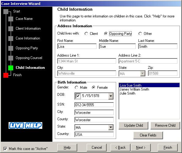
Entering information for a case used to be a bit of a chore (though it was still easier than typing it into each document manually) and in some places the screen was a bit overwhelming with all the places to type and buttons to press.
2016 – Case Wizard
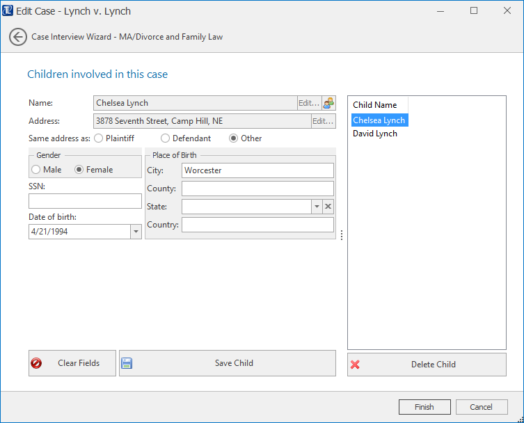
Nowadays though TurboLaw uses a streamlined interface for entering and editing case information – no more screens full of boxes and buttons. Instead, there’s just the basic boxes for names, addresses, and other information – all neatly arranged and logically grouped. Buttons for entering further details (such as the parts of a name or address) are kept right in the same text box, so there’s no confusion about what they do.
TurboLaw has come a long, long way over the years – and for those who remember the old look of TurboLaw and have been with us all this time, we greatly appreciate you. In the future, TurboLaw will continue to evolve to suit the needs of you, our users. We hope you’re just as excited as we are to see what that future TurboLaw looks like, too!